Brochure design
Overview
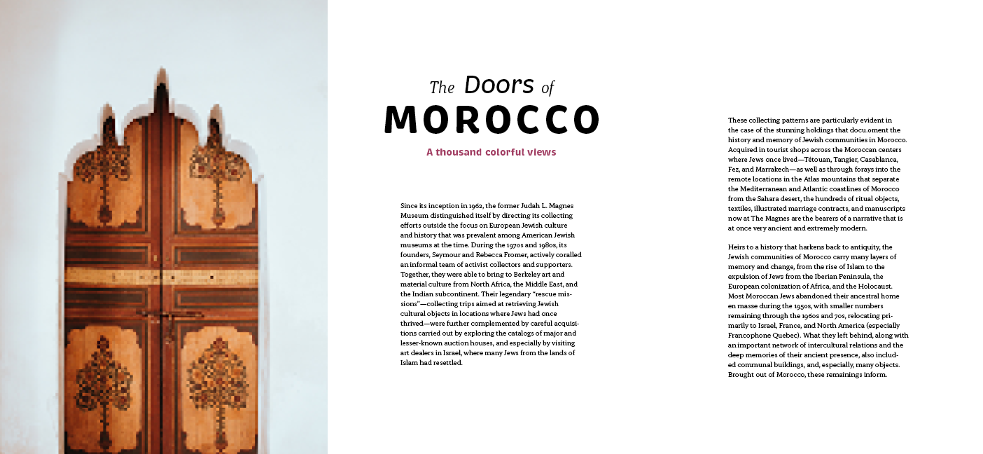
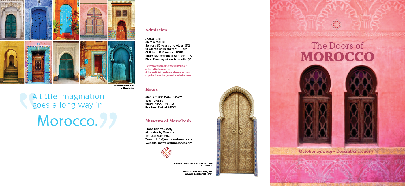
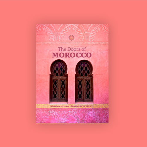
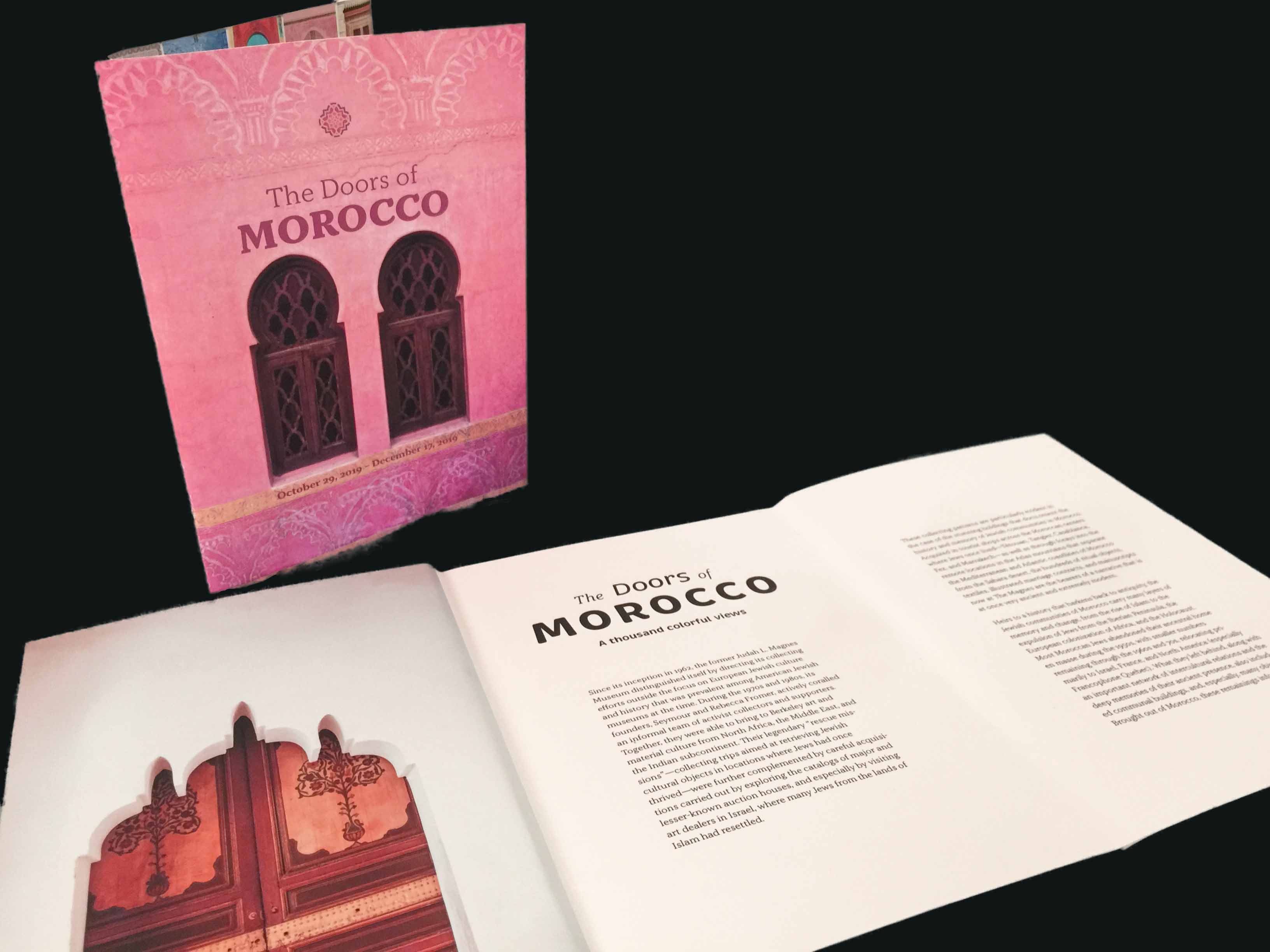
The project requirements were to make a brochure of any type and I chose to create one for an exhibition regarding images of Morocco. I chose to focus upon the architectural elements that make up door and window frames of Morocco with the idea being that as these elements are turned on their hinges to be opened and closed, revealing what is behind, so too are the pages of the brochure. Typeface and margin spacing elements were orchestrated to reference the doors themselves as exotic and mysterious. Pink and blue are common color elements found in Morocco and by incorporating their warm and cool hues, I hoped to show both beginnings and endings, openings and closures, portrayed by the “doors” of pages that are flipped in the brochure.
Design System
Typography

In Morocco, the Arabic alphabet is being used, which is calligraphy style. I chose the typeface of "Brevia" as a title, which is similar looking to calligraphy.
